
10 Principles Of Graphic Design
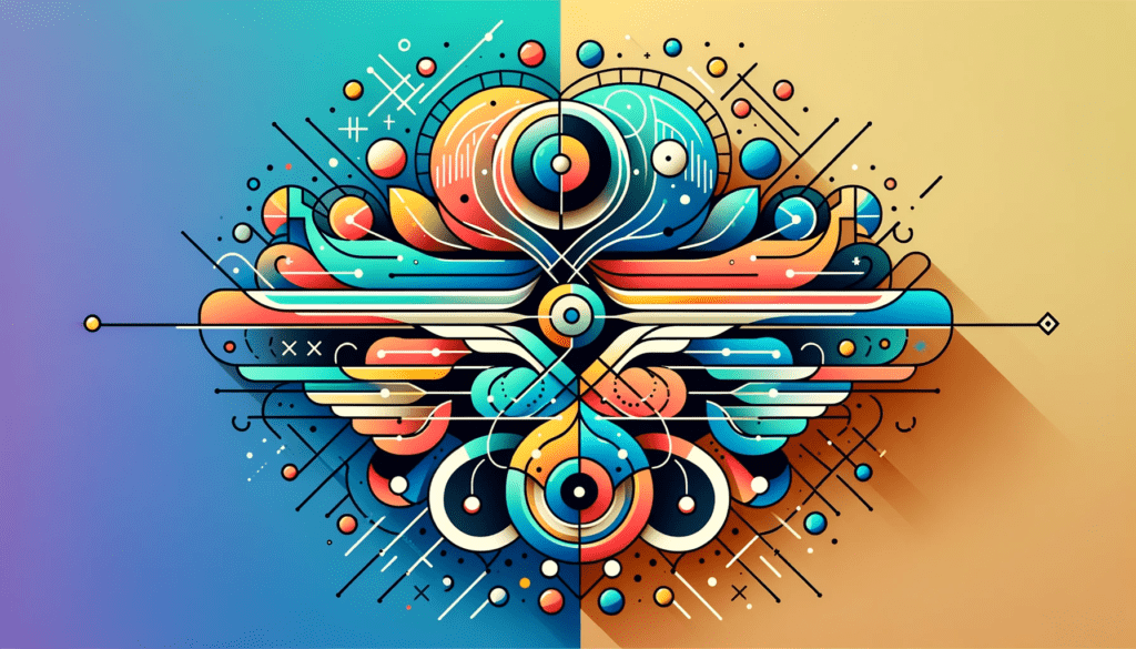
Understanding the fundamental principles of graphic design is crucial for creating impactful and practical designs. These principles are the backbone of excellent graphic design services and play a vital role in how a design communicates its message and engages its audience. This article will explore the ten core visual design principles every designer should master.
1. Balance: Creating Visual Harmony
Balance is about distributing elements in a design to create visual harmony. Whether symmetrical or asymmetrical, achieving balance ensures that no part of the design overpowers another, creating stability and cohesiveness.
2. Alignment: Organizing for Coherence
Alignment involves arranging elements about each other and the overall layout. Proper alignment not only enhances the organization of the design but also contributes to its readability and aesthetic appeal
3. Hierarchy: Directing Viewer Focus
Hierarchy in graphic design prioritizes elements, guiding the viewer’s eye to the most critical parts of the design. Effective hierarchy can be established through size, color, and placement variations, ensuring that key messages stand out.
4. Contrast: Highlighting Key Elements
Contrast adds emphasis and interest to a design by juxtaposing different elements, such as color, size, and shape. High contrast can make crucial elements more noticeable and enhance the overall impact of the design.
5. Repetition: Building Unity and Brand Recognition
Repetition strengthens a design by creating a sense of unity and consistency. Repeating colors, shapes, or patterns can reinforce brand identity and contribute to the design’s overall cohesiveness.
6. Proximity: Grouping Related Elements
Proximity groups related elements together, creating a logical connection and making the design more accessible. This principle helps organize information and improve the readability of the design.
7. Movement: Guiding the Viewer’s Eye
Movement in design influences how the viewer’s eye travels across the page. A well-designed layout can direct attention to specific elements, creating a dynamic and engaging visual experience.
8. White Space: Enhancing Readability and Focus
White or negative space is the empty area around design elements. It’s crucial for preventing clutter, making the design more readable, and highlighting key elements.
9. Proportion: Balancing Element Size
Proportion deals with the relative size of elements in a design. Playing with different proportions can create visual interest, establish focal points, and convey the significance of specific components.
10. Unity: Achieving Visual Harmony
Unity ensures that all design elements work harmoniously, creating a cohesive and complete look. It’s essential for conveying a clear and consistent message through the design.
Mastering these ten graphic design principles is necessary for any graphic designer looking to create compelling, practical, and aesthetically pleasing designs. Whether providing graphic design services or crafting a personal project, these principles form the foundation for successful visual communication.
In graphic design, adhering to these principles can significantly enhance the quality and impact of your work, ensuring that each design looks excellent and effectively communicates its intended message.
Balance: Creating Visual Harmony
Balance in graphic design is crucial for creating a visually pleasing and harmonious composition. It involves the distribution of visual weight of objects, colors, texture, and space. Achieving balance in a design ensures that no single element dominates the others, but rather they all contribute to the overall aesthetic of the piece.
-
Types of Balance:
- Symmetrical Balance: This occurs when elements are mirrored on either side of a central axis. It creates a sense of order and stability.
- Asymmetrical Balance: This involves different elements that have different visual weights but still achieve a balanced composition. It’s often more dynamic and interesting than symmetrical balance.
- Radial Balance: Elements radiate from a central point, creating a circular flow in the design.
-
Importance of Balance:
- Visual Stability: Balanced designs are more visually stable and feel ‘right’ to the viewer.
- Guiding Attention: Proper balance can help guide the viewer’s eye to the focal point of the design.
Alignment: Organizing for Coherence
Alignment is a fundamental principle that brings order to a design. It aligns elements to create a sharper, more unified appearance, making the design easier to follow and more cohesive.
-
Types of Alignment:
- Edge Alignment: Aligning elements along their top, bottom, left, or right edges.
- Center Alignment: Placing elements along a central line.
- Text Alignment: Aligning text to the left, right, center, or justifying it to ensure legibility and coherence.
-
Benefits of Alignment:
- Professional Look: Proper alignment creates a clean, professional look.
- Improved Readability: Especially in text-heavy designs, alignment is key to readability.
- Logical Structure: Helps create a logical flow in the design, guiding the viewer’s eye through the content.
Both balance and alignment are integral in creating graphic designs that are not only aesthetically pleasing but also effectively communicate their intended message. These principles are essential in the toolkit of graphic design services, where the goal is to create designs that resonate with the audience while maintaining clarity and visual appeal.
Hierarchy: Structuring for Clarity and Focus
Hierarchy in graphic design is pivotal for directing the viewer’s attention to essential elements. Establishing a clear hierarchy makes a design visually appealing but also functional and user-friendly.
Significance of Hierarchy
The hierarchy in a design organizes information according to its significance. By varying the size, color, and positioning of elements, designers can indicate which parts of the design are most important. This structure is essential for conveying the intended message effectively and ensuring that the crucial aspects catch the viewer’s eye first.
Techniques for Creating Hierarchy
Effective hierarchy can be achieved through a variety of techniques:
- Size and Scale: Larger elements naturally draw more attention.
- Color and Contrast: Using bright colors or high contrast for key elements makes them stand out.
- Typography: Different font sizes, weights, and styles can establish a visual hierarchy.
- Placement: Strategic positioning of elements based on importance helps guide the viewer’s journey through the design.
Contrast: Enhancing Visual Interest
Contrast in graphic design is using opposing elements to create visual interest and draw attention to critical aspects of the design.
Importance of Contrast
Contrast is a powerful tool in graphic design as it helps to differentiate and highlight various elements within a design. It can make crucial information more noticeable and enhance the overall visual appeal of the design.
Implementing Contrast
- Color Contrast: Using colors that stand out against each other.
- Size Contrast: Varying sizes can create a focal point.
- Typographic Contrast: Combining different fonts to add variety and emphasis.
- Shape and Texture Contrast: Mixing shapes and textures to create depth and interest.
Repetition: Building Consistency and Recognition
Repetition involves using similar elements throughout a design to create a sense of unity and consistency.
Role of Repetition
Repetition strengthens a design by creating a recognizable and coherent pattern. This can be particularly effective in branding, where consistent repetition of colors, logos, and design motifs can significantly enhance brand recognition.
Repetition Strategies
- Consistent Color Scheme: Repeating the same color palette throughout the design.
- Recurring Motifs: Using specific shapes, icons, or patterns across different elements.
- Typography Consistency: Maintaining the same font style or family in various design parts.
Proximity: Organizing for Clarity
Proximity is the principle of grouping related elements, creating a clear relationship between them, and making the design more organized and digestible.
Benefits of Proximity
- Enhances Organization: Grouping related items helps create a cleaner and more organized design.
- Improves Readability: Proximity can make complex information more accessible and easier to navigate.
- Creates Logical Groupings: Helps viewers understand which elements are connected or part of the same category.
Applying Proximity
- Grouping Elements: Place related items near each other.
- Utilizing White Space: Adequate spacing between groups can further enhance the clarity of the design.
- Logical Layout: Arrange elements to reflect their relationship and importance
Mastering these principles is essential for any graphic designer aiming to create effective, visually compelling designs. Each principle plays a crucial role in the design process, whether establishing a clear hierarchy, using contrast to highlight critical elements, employing repetition for consistency, or organizing content with proximity. By understanding and applying these principles, graphic designers can ensure their work captures attention and communicates its message clearly and effectively.
Understanding and applying these principles ensures your graphic design services stand out in a crowded market. It’s not just about creating something that looks good; it’s about crafting designs that communicate effectively, resonate with the audience, and drive the desired response.
Movement: Creating a Dynamic Flow
The principle of movement in graphic design is about deliberately guiding the viewer’s eyes through a design. This dynamic flow can be achieved through the strategic placement and orientation of elements.
Understanding Movement in Design
- Directional Cues: Elements like lines, arrows, or even the direction a model is looking can guide the viewer’s eye.
- Visual Pathways: Creating a path for the eye to follow enhances the storytelling aspect of the design.
- Dynamic Layouts: Instead of static, grid-based layouts, incorporating diagonal or curved lines can create a sense of motion and liveliness.
Implementing Movement
- Sequential Arrangement: Placing elements in a way that naturally leads the eye from one component to the next.
- Contrasting Elements: Using contrast to draw attention to areas where you want the viewer’s eye to move.
- Layering: Layering elements can create depth, guiding the eye across the design.
White Space: The Art of Nothingness
White or negative space is an essential element in graphic design. It refers to the areas of a design that are not filled with content.
Importance of White Space
- Clarity and Readability: White space prevents clutter, making the content more readable and understandable.
- Focus and Emphasis: It can highlight essential elements, drawing the viewer’s attention to specific areas.
- Aesthetic Appeal: Proper use of white space contributes to the overall aesthetic quality of the design, giving it a clean, uncluttered look.
Utilizing White Space
- Balance and Harmony: Distribute white space evenly to create a harmonious layout.
- Breathing Room: Allow adequate space around design elements for them to stand out and be easily distinguishable.
- Minimalist Approach: Sometimes, less is more. A minimalist design with ample white space can be powerful and impactful.
Proportion: The Scale of Elements
Proportion in graphic design refers to the size relationship between various elements within a design.
Role of Proportion
- Visual Interest: Playing with different proportions can create focal points and make a design more engaging.
- Hierarchy and Emphasis: Larger elements tend to draw more attention, making proportion a tool for establishing hierarchy.
- Balance and Harmony: Proper proportion among elements contributes to the overall balance and harmony of the design.
Techniques for Proportion
- Scaling: Adjust the size of elements relative to each other to create a sense of importance.
- Grid Systems: Use grid systems to achieve balanced proportions.
- Golden Ratio: The golden ratio can be used as a guide for aesthetically pleasing proportions.
Unity: Bringing It All Together
Unity in graphic design is about creating a cohesive, well-integrated composition where all elements harmonize.
Achieving Unity
- Consistent Styling: Using consistent colors, fonts, and stylistic elements throughout a design.
- Grouping: Placing related elements together to create a unified group.
- Overall Theme: Ensuring all elements adhere to a central theme or concept.
Importance of Unity
- Cohesiveness: Unity makes a design feel like a coherent whole.
- Effective Communication: A unified design communicates its message more effectively.
- Professional Appearance: Designs that exhibit unity are often perceived as more professional and well-thought-out.
Mastering these ten graphic design principles is crucial for creating compelling, practical designs. From establishing a visual hierarchy to utilizing white space for clarity, each principle plays a vital role in the design process. As graphic designers, understanding and skillfully applying these principles ensures that our work looks aesthetically pleasing, communicates effectively, and resonates with our intended audience. In the competitive field of graphic design services, these principles are the key to creating work that captures attention and achieves its communication goals effectively.
Proportion: Mastering Scale and Size Relationships
Proportion in graphic design is crucial in creating visual harmony and balance. It involves the size relationship between different elements within a design and dramatically influences how a viewer perceives the composition.
The Impact of Proportion
- Focal Points: By varying proportions, designers can direct attention to specific areas of a design.
- Balance and Harmony: Proportionate elements contribute to a balanced, visually appealing layout.
- Communicating Importance: Larger elements can signify greater importance, making proportion a tool for visual hierarchy.
Techniques in Proportion
- Scaling: Adjusting the size of elements to create interest or focus.
- Reference Points: Using known objects as reference points to provide a sense of scale.
- Contrast in Size: Juxtaposing small elements with large ones for dramatic effect.
Unity: The Cohesive Force in Design
Unity in graphic design refers to all design elements’ cohesive, harmonious use. It ensures that all design components are seen as part of a whole rather than as separate pieces.
Achieving Unity in Design
- Consistent Style: Maintaining a consistent style across all elements, from typography to color schemes.
- Repetition: Repeating certain elements, like shapes or colors, to unify the design.
- Theme and Concept: Aligning all elements with the overarching theme or concept of the design.
Benefits of Unity
- Cohesive Aesthetic: Unity provides a coherent and harmonious aesthetic pleasing to the eye.
- Effective Communication: A unified design communicates its message more effectively, as all elements support the central theme.
- Professionalism: Designs that exhibit unity are often perceived as more polished and professional.
Understanding and applying these ten graphic design principles is essential for any designer looking to create practical and visually appealing work. These principles form the foundation of good design, guiding visual elements’ arrangement, presentation, and impact. From achieving balance and harmony with proportion to unifying a design for maximum impact, each principle plays a vital role in crafting impactful and memorable designs.
In graphic design services, these principles are not just guidelines but essential tools that enable designers to communicate messages clearly and create designs that resonate with audiences. Whether you’re a seasoned professional or just starting, mastering these principles is critical to developing your skills and creating work that stands out in the competitive field of graphic design.
This concludes our exploration of the ten principles of graphic design. Each principle, from balance to unity, is crucial in creating compelling visual communications. By mastering these principles, graphic designers can ensure their work is aesthetically pleasing and effective in conveying the intended message.
Resources: https://www.lcca.org.uk/blog/careers/7-basic-principles-of-graphic-design/